The problem
People were reaching the deposit screen and leaving.
Nearly half the people who reached the last step of an exchange — sending their own money to a deposit address — left without finishing. Analytics showed where, not why.
The product
Swap crypto anonymously, safely, at a competitive rate
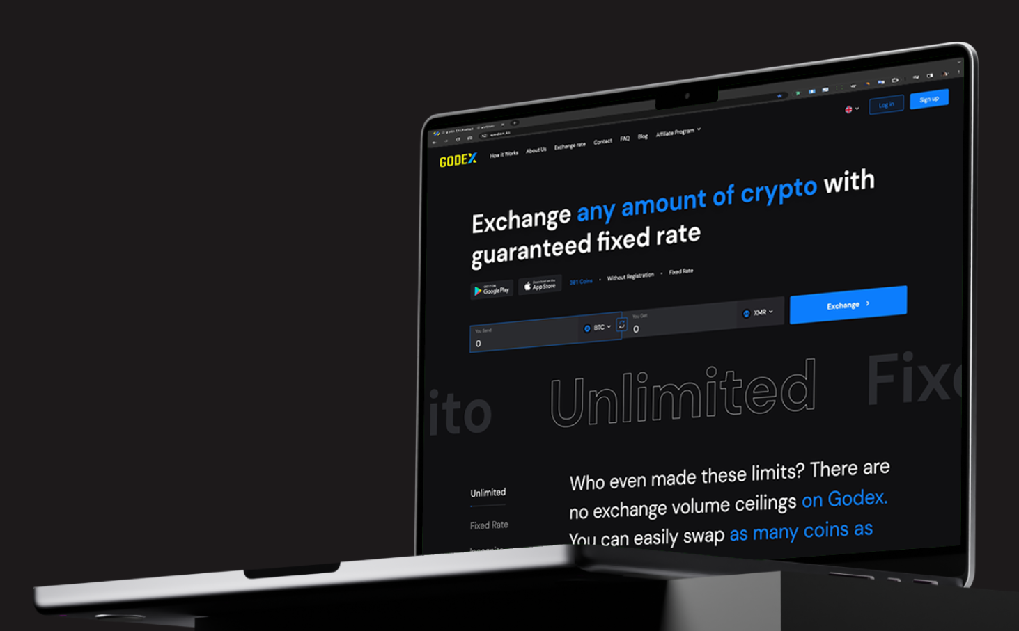
Godex exchanges one cryptocurrency for another — 380+ of them, without registration. It tracks rates across partner platforms — Binance, Bitfinex, HitBTC and others — in real time, and quotes the best one it finds.
That rate is then held while you transfer, as with most instant exchangers. The window is thirty minutes — ordinary for this kind of service. The problem is what a visible countdown does to the person sending money.
The moment
Step three: send the deposit
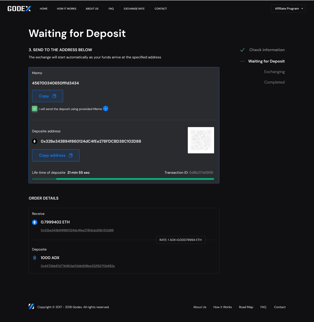
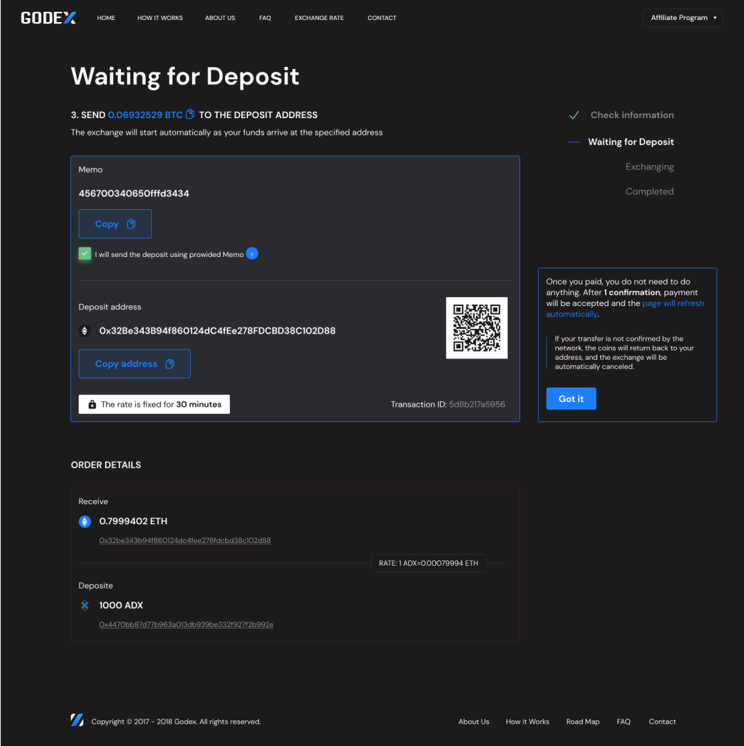
An exchange runs in four steps. On the third, the site shows a deposit address and waits — the user sends their own coins to it from wherever they hold them.
Godex earns a fee on every exchange that completes, so the more transactions go through, the higher the profit. An abandoned deposit is a transaction the business never gets.
That is the step the analytics pointed at.
01Choose the currency
Pick the pair and the amount, see the rate.
02Enter the wallet address
Where the exchanged coins should arrive.
03Send the deposit
Send your own coins to the address shown, then come back.
04Wait for confirmation
The network confirms, the swap runs, the coins land.
Who it’s for
Traders in the US and Europe
Traders, working across two monitors or a laptop and on mobile. English plus a native language, so wording has to stay plain.
Three things they said mattered before starting an exchange:
Remain anonymous
No account, no identity check.
Secure their own funds
The coins should not sit with the exchange longer than the swap takes.
Understand the fee structure
Before starting an exchange, not discovered at the end of it.
The hunch
The countdown kept running while the user was off the site
Green reads as safe. A live timer tells the truth — this is exactly how long you have. It should have been the reassuring part of the screen.
It did the opposite. With something visibly running out, people could not concentrate on the one task that mattered — and in half of cases they had to leave the page to transfer anyway, coming back to a timer that had never stopped.
Inference, not observation. No interviews, nobody watched an abandonment live. Which is why the next step was a test, not a launch.
The A/B test
I initiated the test
I proposed running the redesign as an A/B test rather than deciding it in a meeting: half the traffic on the new screen, half on the old, for a month. Analysts and developers ran it.
The control group is what makes the number mean anything. Crypto volumes swing a lot on their own — without a group on the old screen at the same time, we could not have told a design effect from a market swing.
- 50/50 split, randomly assigned
- Desktop and mobile measured separately
- One month of data, monitored by analysts and developers
- Same market conditions for both groups
What I changed
I replaced the timer with a sentence
The countdown became a plain statement: the rate is fixed for 30 minutes, with a lock. Same fact, nothing moving.
I pulled the aggressive colour out and added a note for what happens after you pay: one confirmation, then the page updates itself.
The risk I took
Without a visible timer, some people miss the deadline and come back to a dead order. I took that trade for the larger group who were leaving under the pressure of watching it.
On mobile
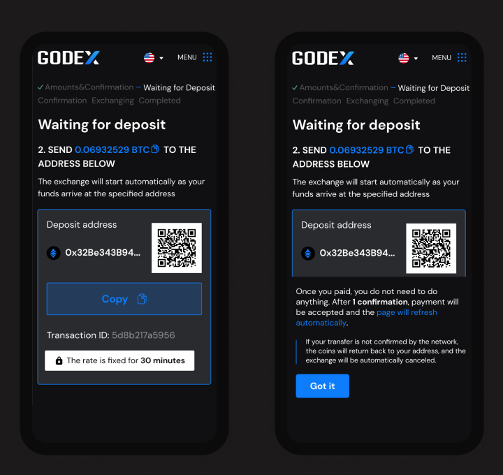
The same two changes on mobile
On a phone there is no room to place an explanation next to the element it explains, so both changes had to sit in the reading order.
The fixed-rate line sits under the address; what-happens-next gets its own screen.
The result
Fewer people left the screen
It went to all traffic after the test, and is still running five years later — through market cycles, team changes and product rewrites.
The rest of the product
The exchange-rate pages
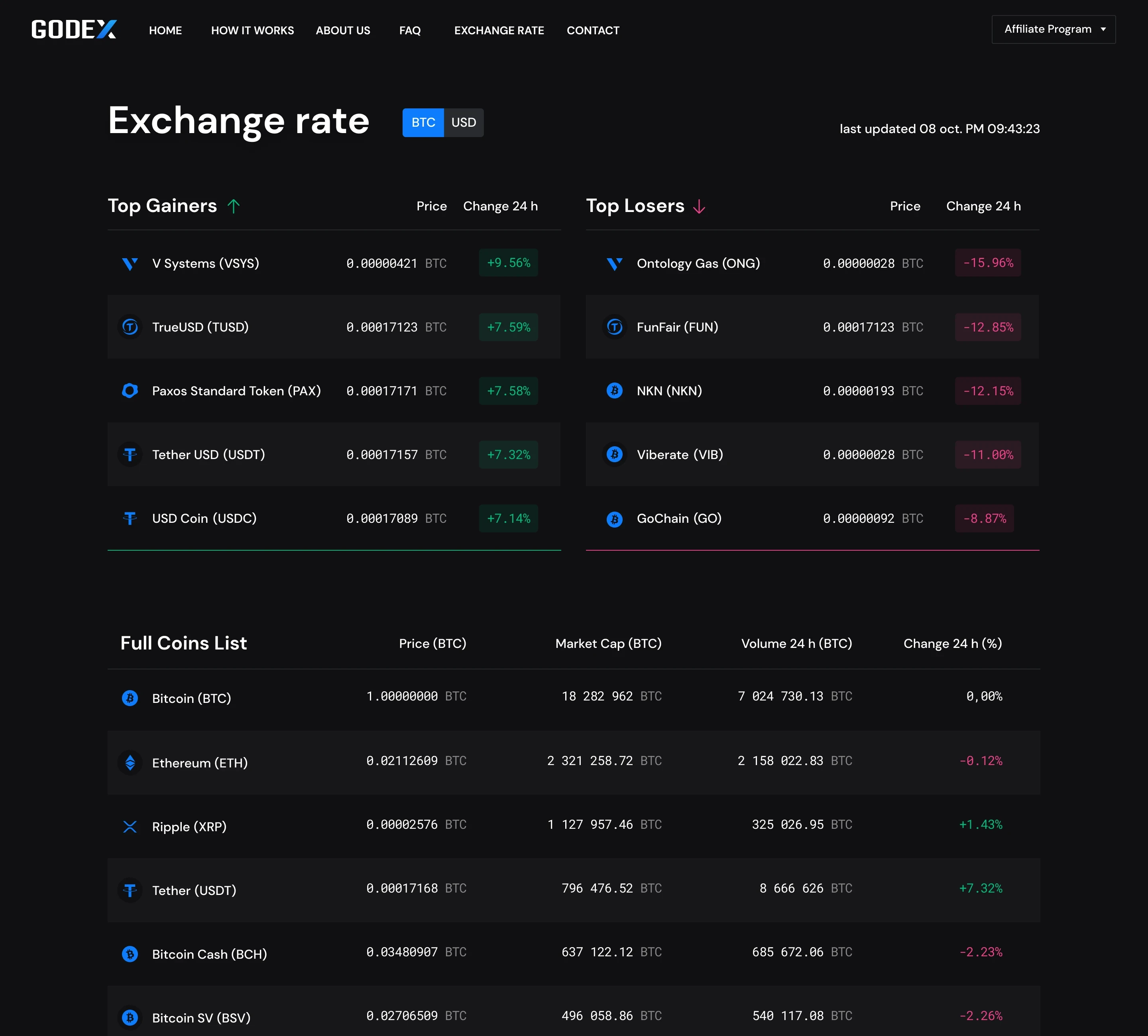
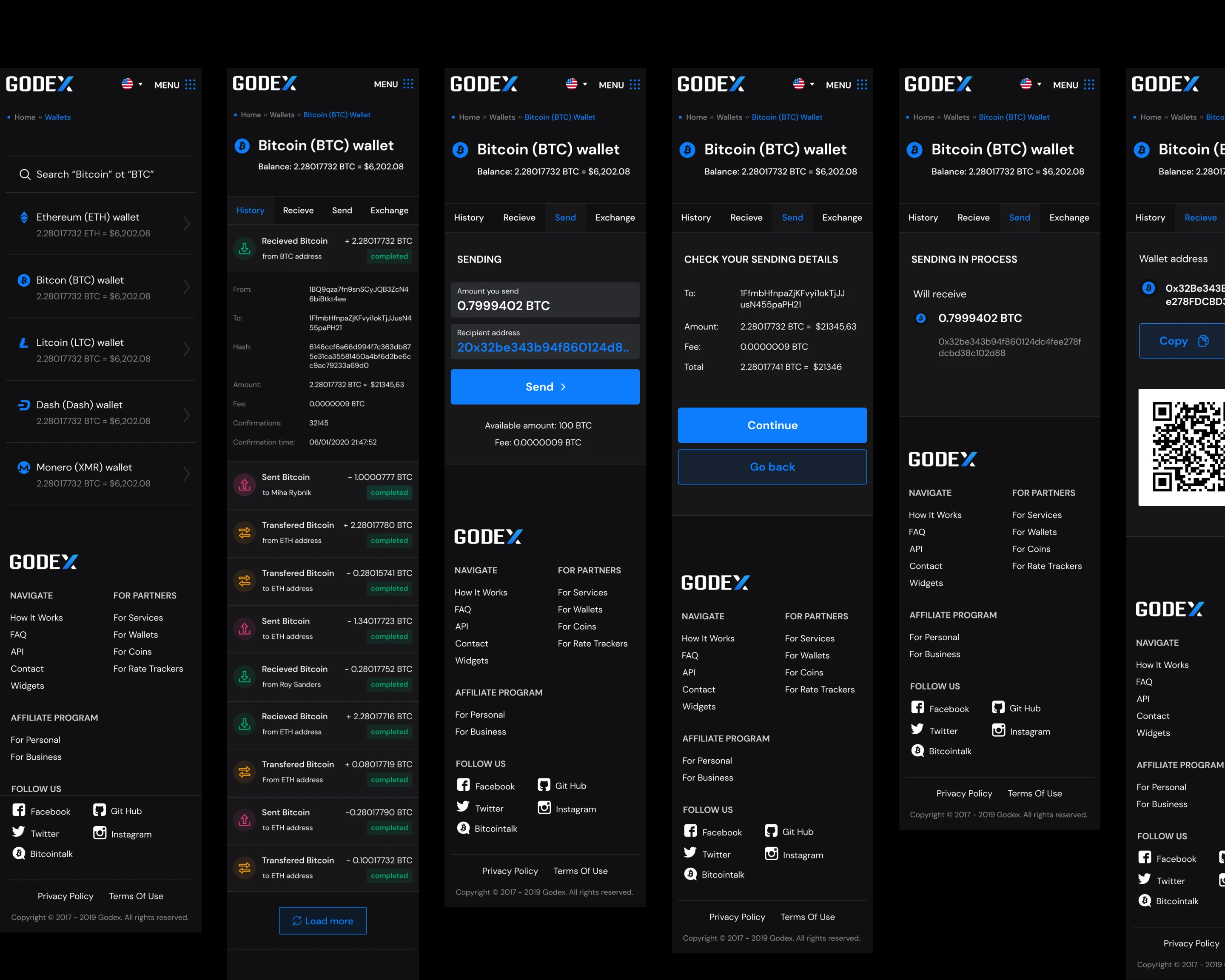
The deposit screen was the piece we tested. The rest of 2019–2020 went on the product around it — the mobile app shown above, registration, data protection, the B2B and B2C landings, and the exchange-rate pages.