Who it’s for
The conversation every employee has once a year
Tesco is the UK’s largest retailer. Somewhere in it, 367,000 people have a yearly conversation about how their job is going and where it goes next.
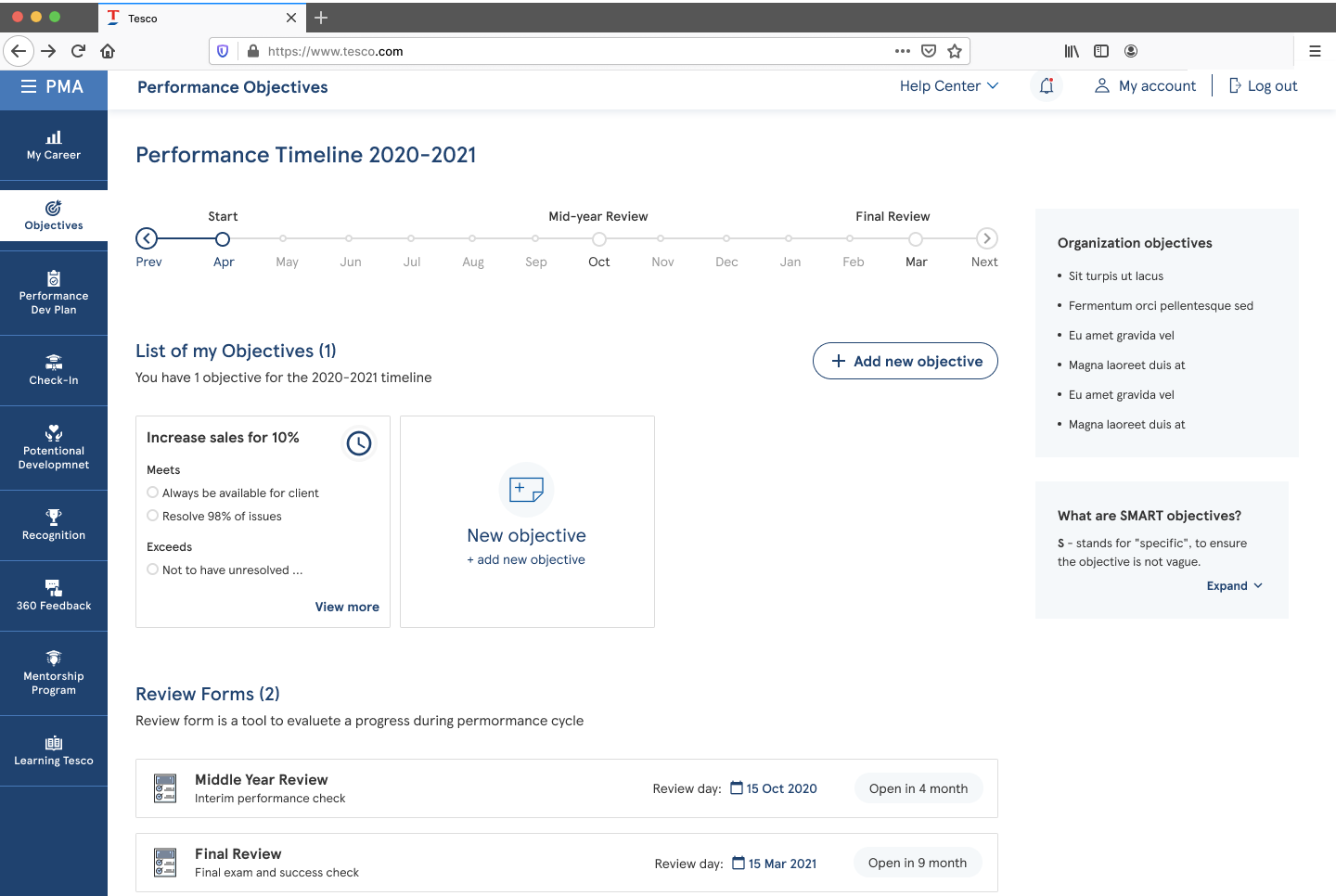
The Performance Management Application is where that conversation lives. HR teams and line managers use it to set goals, agree priorities, build development plans and run the annual appraisal — a B2B SaaS product with an internal audience, which is its own kind of hard: your users cannot churn, they can only resent you.
In 2020 Tesco set out to improve how it talks to colleagues about their careers. PMA was the product built to do it.
The wall
The design system we were supposed to build on did not exist yet.
Tesco already had many products, and the core design team was building a company-wide system at exactly the moment PMA development started. It was not available to us. Every variation had to be drawn by hand, and without shared components the experience came out slightly different on every screen.
The choice
Three options, none of them free
We could wait for the central system and lose months. We could invent our own and guarantee a painful divergence later. Or we could build a bridge: a separate sub-library, made to be folded back into the main system once it landed.
We took the third. It bought the delivery team speed immediately, at the cost of a merge we knew was coming and would have to pay for.
We built it in Figma specifically for the real-time collaboration — not for the drawing tools, but because it stopped the team burning hours on which file was current.
What this case is not
This was a design-operations problem, not a research one. The evidence here is delivery data — how much got built and how fast — not user testing. Worth saying plainly rather than dressing it up as something it was not.
1. Tokens first
Type, colour and spacing given one source, applied across the whole design.
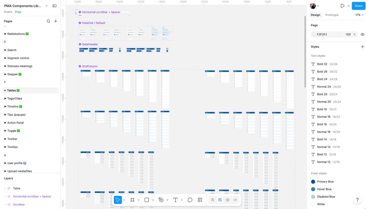
2. Components with every state
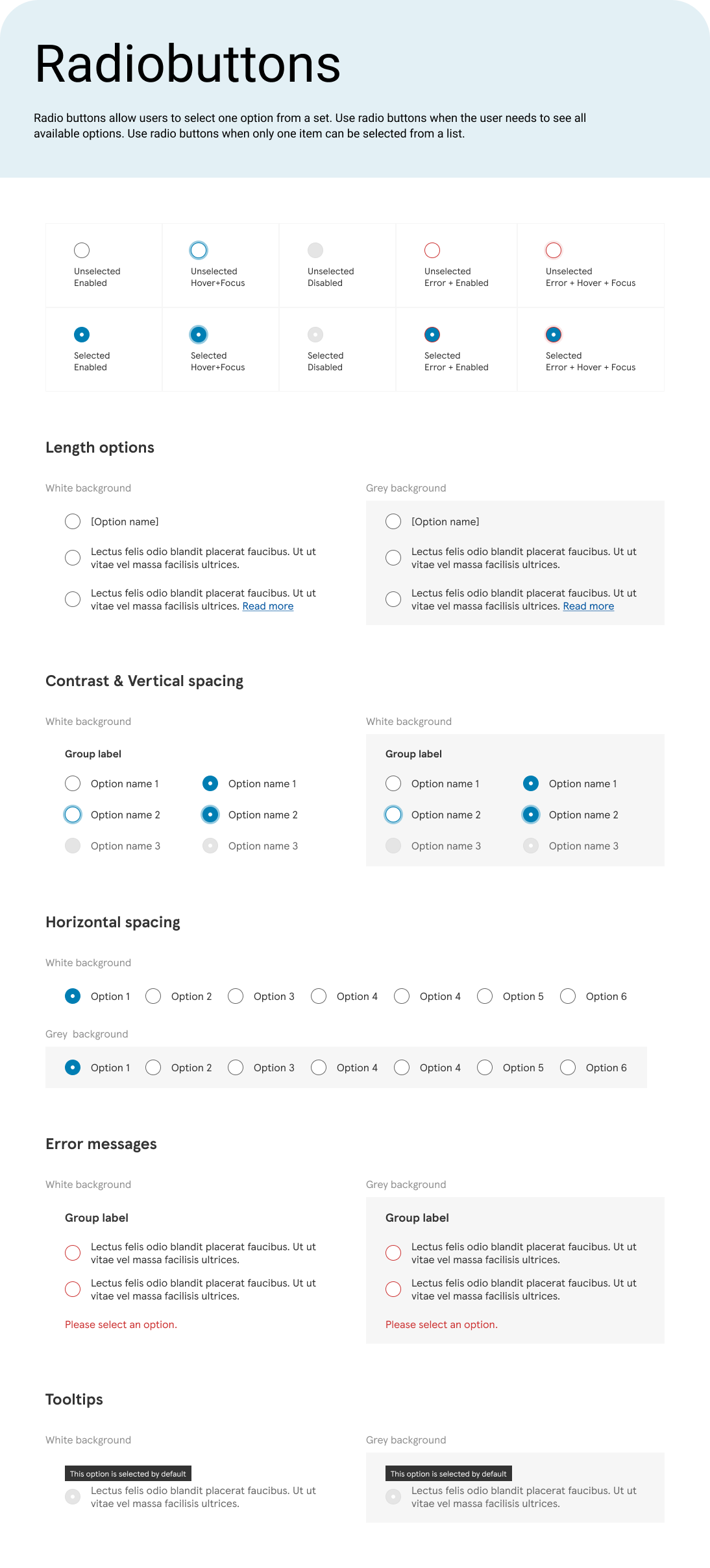
Default, hover, loading, expanded, filled, disabled — defined once, not redrawn per screen.
3. Applied across every journey
Then the file organised by version, so the team could see what changed and when.
Inside the library
Rules, not just shapes
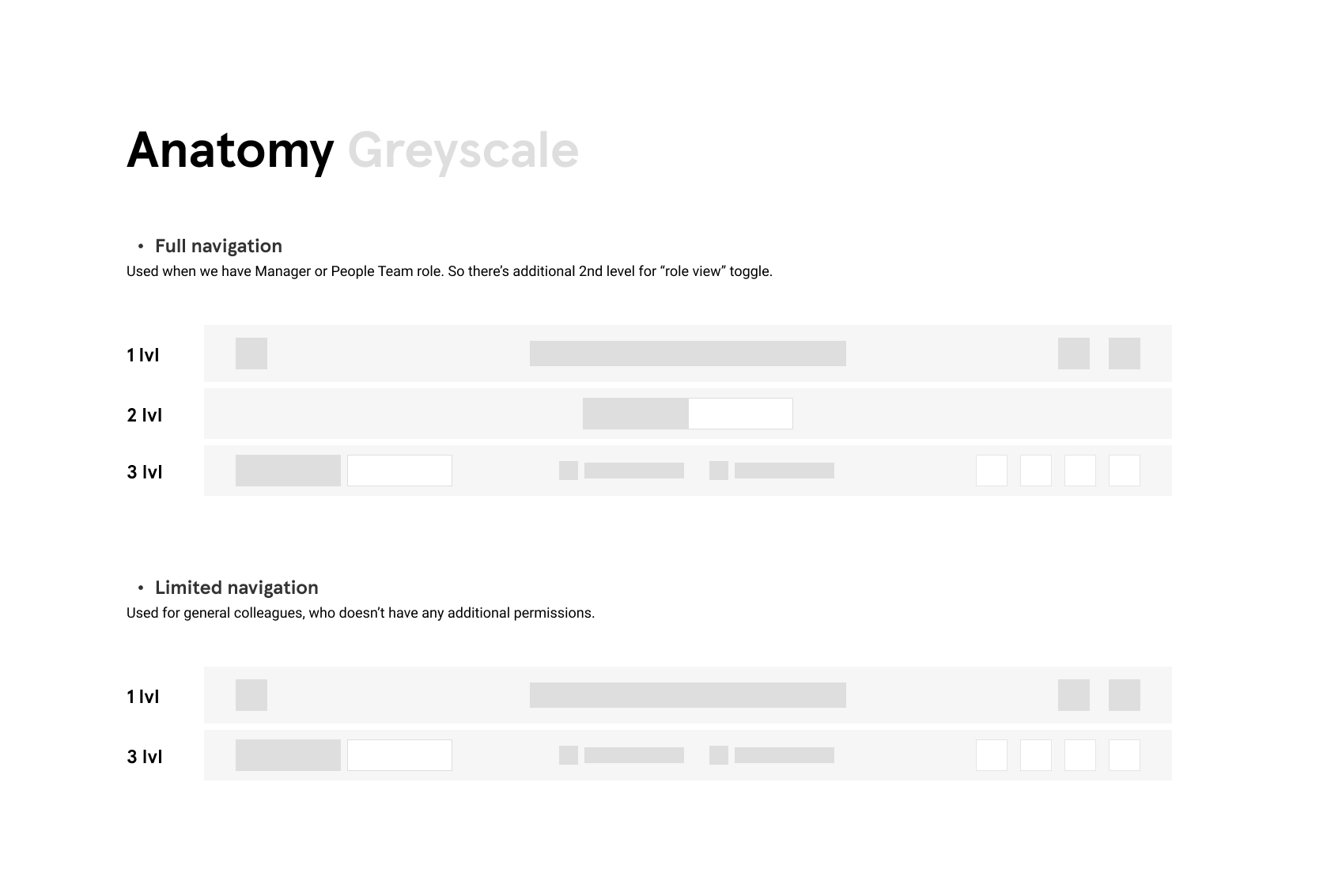
A component is only reusable if the decisions around it are written down. Each one came with three things: its anatomy, its full set of states, and the words that go inside it.
That is what stops a library drifting. A designer joining the file does not have to guess which grey means disabled, and a developer does not have to ask what the error message should say.
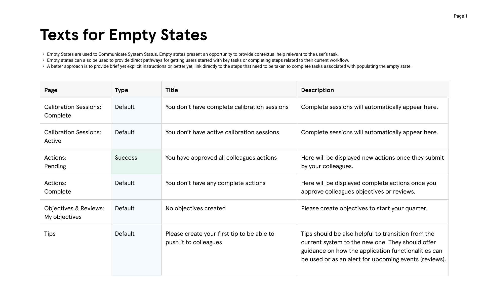
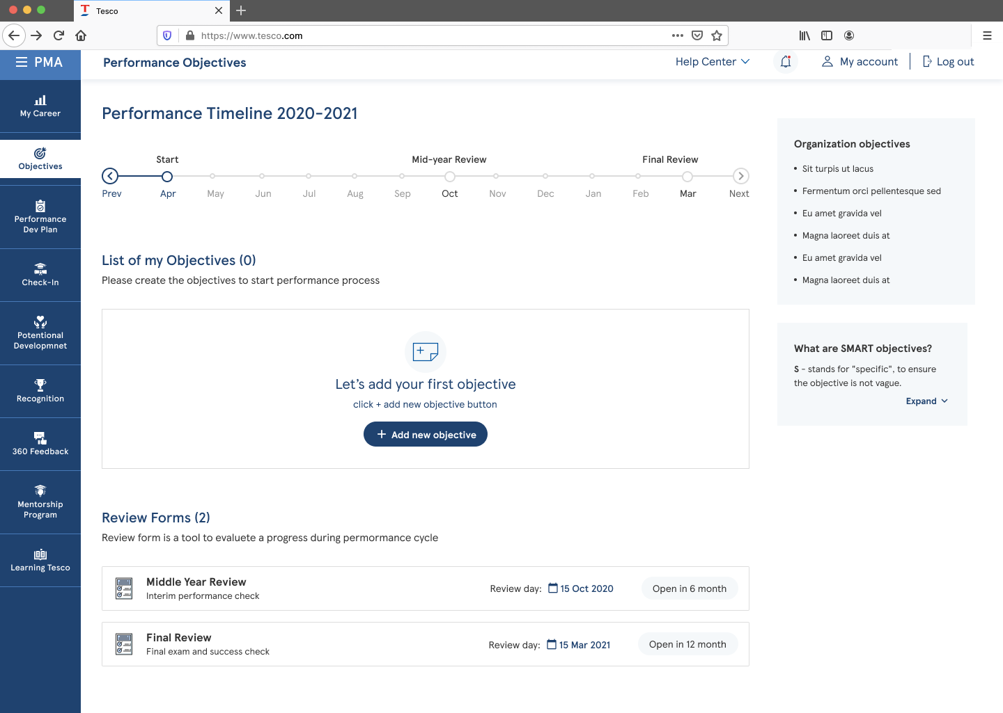
The copy was part of the job, not someone else’s. Empty states especially — I wrote the title and description for every one, page by page. “No data” is a dead end; the empty state is the one moment where you can tell someone what to do next.
How it paid off
One change, everywhere at once
The point of a library is not tidiness. It is that when a designer updates a component, every page in the file updates with it — so a decision taken once stops needing to be re-taken on thirty screens.
It also constrains usefully. A component library keeps designers inside the product’s own rules, which means fewer surprises reaching development and fewer arguments about whether something is a variant or a mistake.
What changed
Half the time, and a system that outlived the project
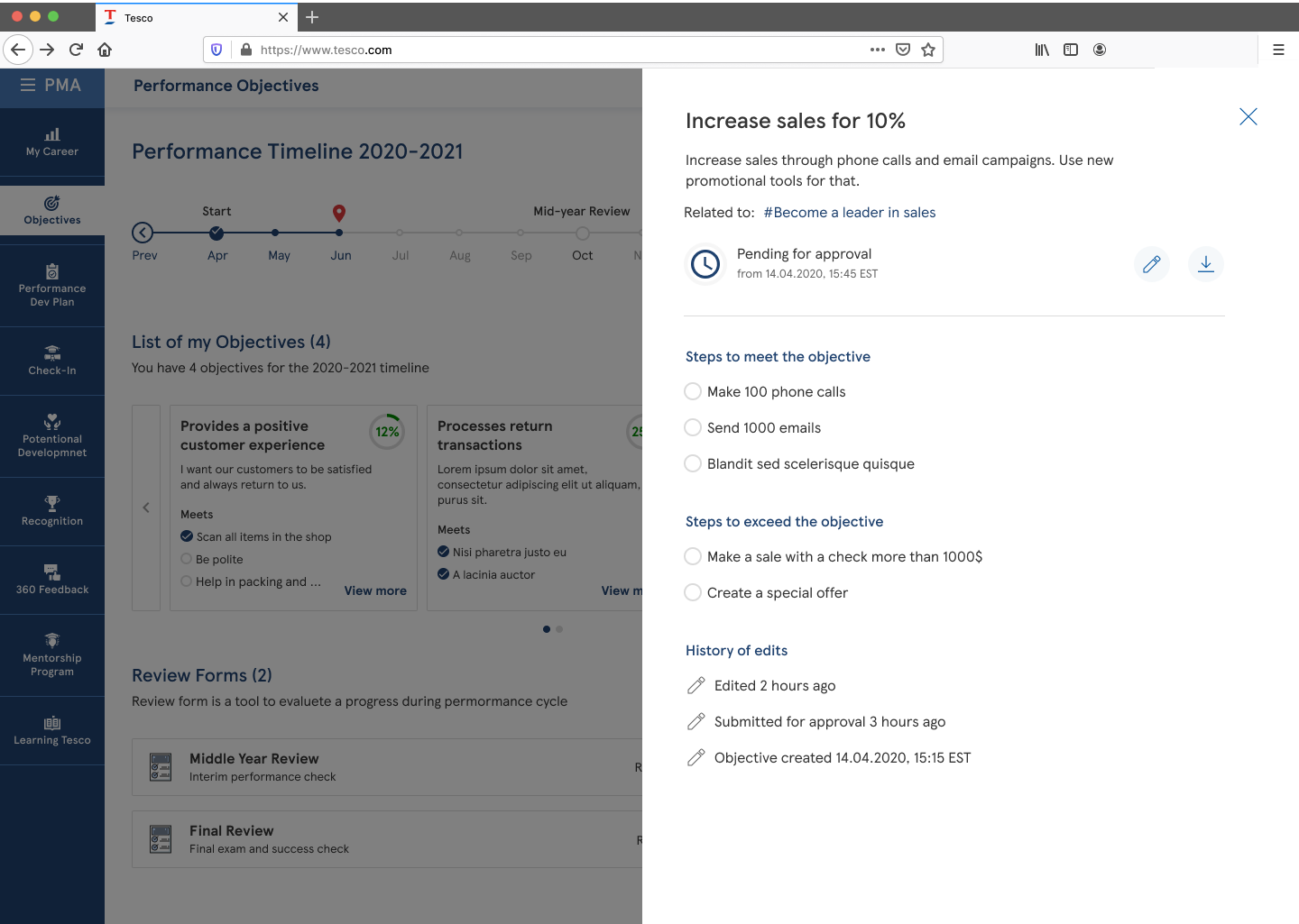
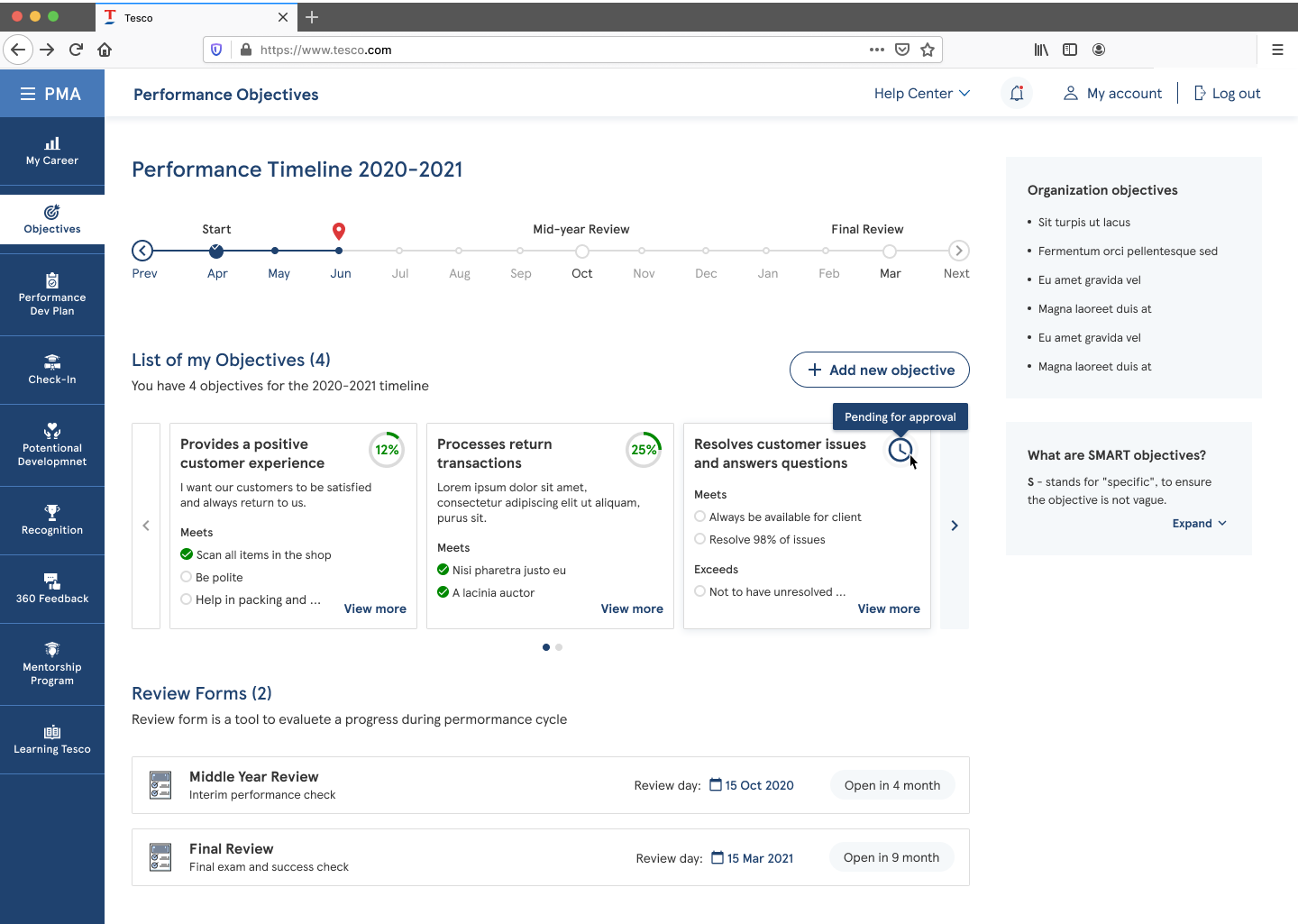
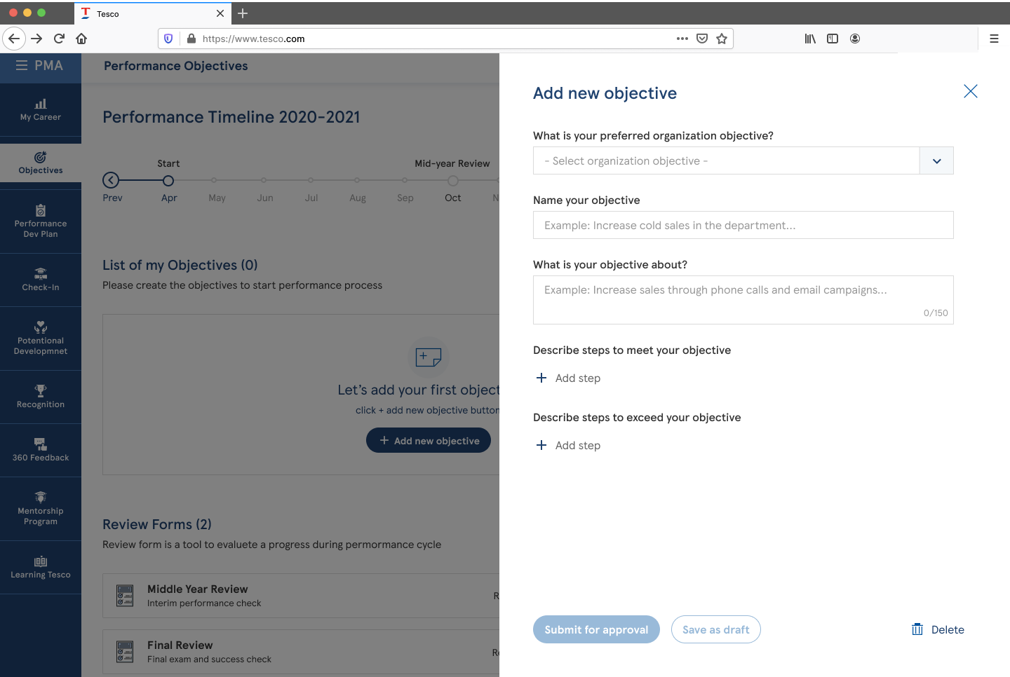
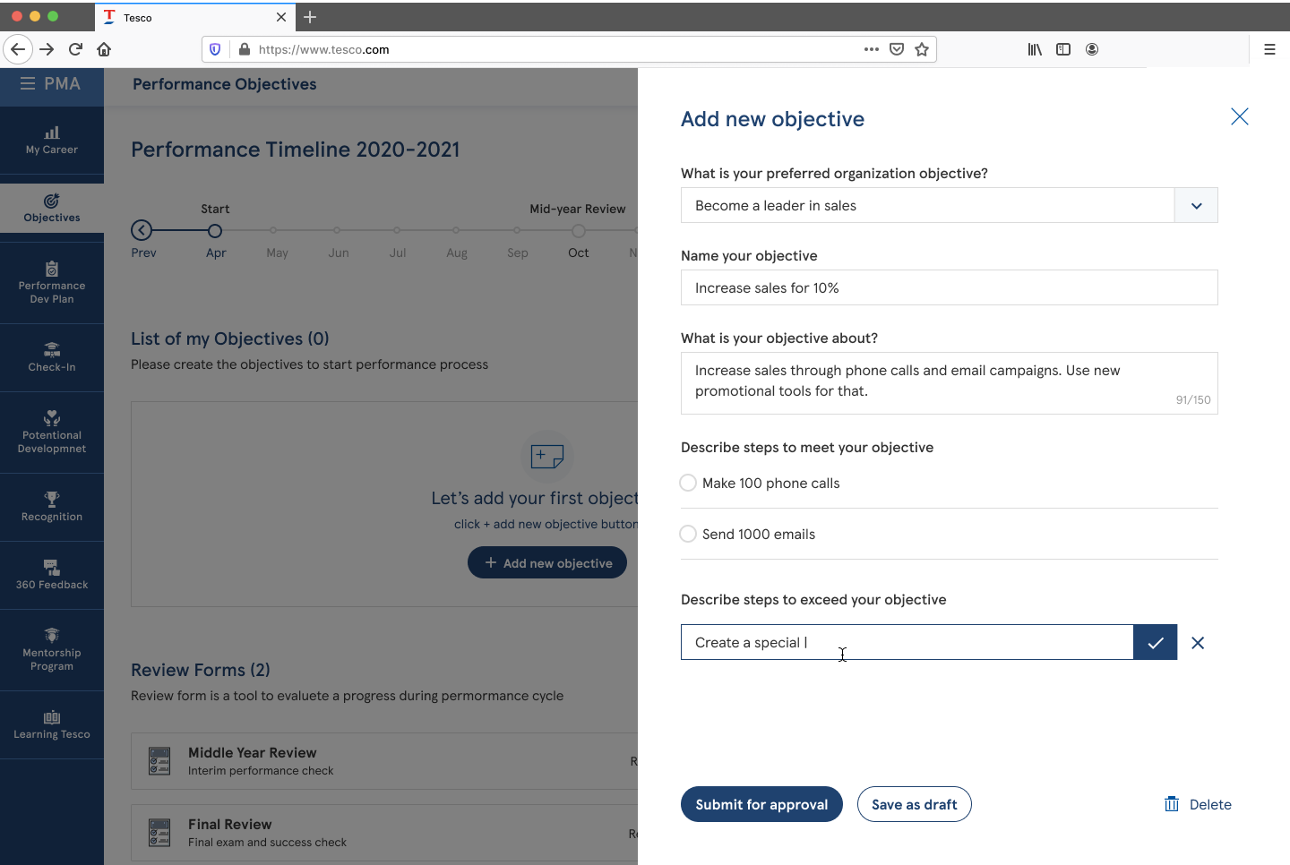
We designed and shipped 35+ flows against the library, and completed the project in roughly half the time it would otherwise have taken. Handoff to development got noticeably quieter — fewer rounds of “is this intentional?”
Tesco launched the first release and kept improving it in later ones, adapting the tool for different colleague groups. The sub-library folded back into the company-wide system, which was the whole point of building it that way.
- 35+ flows delivered against a library built mid-project
- Project completed in about half the expected time
- Design-to-development handoff streamlined
- Sub-library merged into the company-wide design system
- Shipped, then adapted for further colleague groups