Who it’s for
People deciding where to drill
Before anyone drills a well, a team of geologists and geophysicists has to answer one question: what is down there, and is it worth going after?
They answer it by reading seismic data — echoes bounced off rock layers kilometres underground, turned into images. Their job is to interpret those images: where the rock folds, where oil or gas could be trapped, where a well would hit it and where it would miss.
A single well costs tens of millions. Their reading of the data is what the money rides on.

The brief
“Make it faster to learn. And what else can we add?”
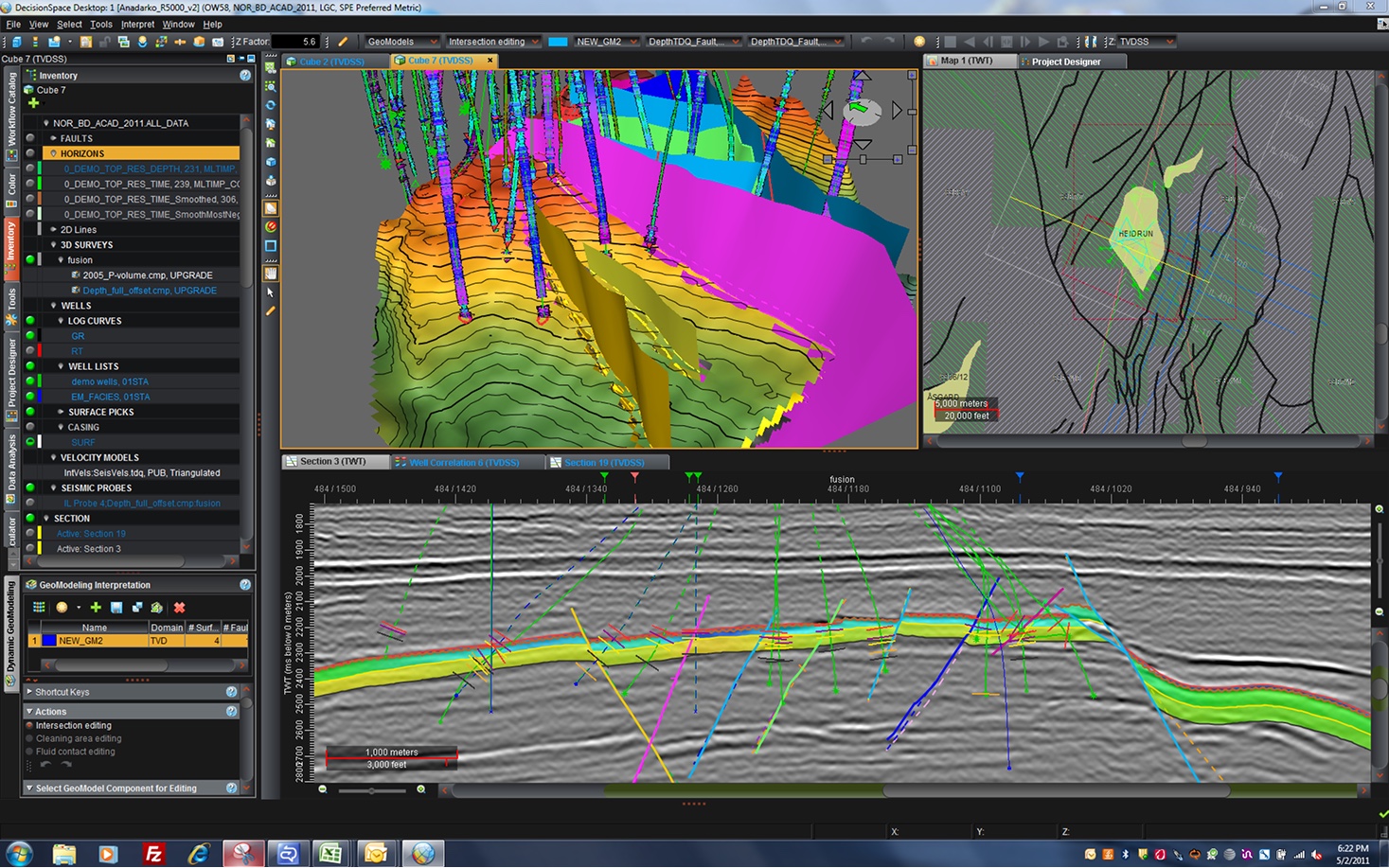
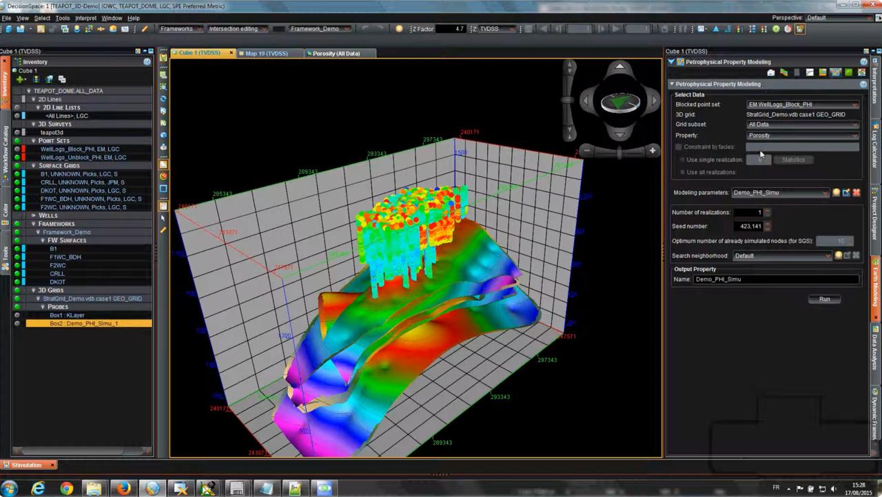
DecisionSpace® Geosciences is the software those teams work in. Halliburton had been building it for over a decade, and it had grown to match: 10+ modules wired into each other, seven delivery teams shipping into it.
It took a new user three to seven months to become productive. That number had stopped being a usability statistic and become a sales problem — buyers were doing the maths on months of lost work.
So the client arrived with two questions:
“How do we shorten that?”
“What new functionality can we offer?”
The second one carried an assumption inside it: that the answer was more. Testing that assumption turned out to be the whole job.
1A decade of accumulated product
Ten-plus modules, tightly coupled — change one and the others feel it.
2Seven teams, seven roadmaps
Each with its own backlog, priorities and stakeholders. No shared prioritisation.
3Users with decades of habit
Long-time specialists who had built their working lives around the existing tool.
4A domain I had to learn
Without the geoscience, you cannot tell a real complaint from a preference.
The numbers that framed it
The research
Nobody had ever asked these users anything
In more than ten years of the product, no structured user research had been done on it. Features were being built from technical requirements and whoever asked loudest.
I led a team of four designers through it. I set the goals with the client, built the roadmap, and split the existing documentation across the team to digest — before we spoke to a single person. Then we started talking.
None of them had run a study at this scale before. So I paired them for the first interviews, wrote the guide we all worked from, and ran a debrief after every session — partly to keep the analysis honest, mostly so they learned to hear the difference between a complaint and a cause. By the second month they were running sessions alone and bringing me findings, not transcripts.
40+ interviews, 30–60 minutes each
Recruited through the internal employee network, across seven workflows and several time zones. Some ran through an interpreter — which changes how you ask: shorter questions, no idioms, and you watch the screen more than you listen.
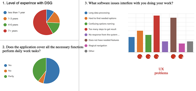
A short survey to size the problem
Measured against two things that actually matter: how long before someone works without help, and how many workflows are blocked outright.
Workflow mapping with domain experts
Demo sessions where specialists walked us through their real work, so we could map what the job looks like end to end rather than what the menu structure implies.
What this method could not tell us. The survey sized which problems were most widespread; the interviews explained why they hurt. Both rest on what people report, not on what they do — and long-time users had lived with their workarounds so long that some friction no longer registered as friction. Neither method could connect a problem to money: we could rank what to fix, but not say what any of it was costing in renewals or lost deals.
The most telling answer
Most users said the product was missing functionality. It wasn’t missing.
Most respondents said the product did not cover their daily work. That was the answer that reached leadership — and why they arrived asking what to build next.
We took the complaints back to the product owners. Almost every “missing” capability already existed, some of it shipped years earlier. Behind the navigation, the learning curve and the bugs, users simply could not find it.
What we found
Three facts that changed the question
600+ pages in the manual
The documentation is not something a stuck person reads their way out of.
No internet at some client sites
Security rules cut them off. Every video tutorial explaining how to solve a problem is unreachable.
2 wks to resolve some support tickets
When the software blocks you, the escape hatch can take a fortnight to open.
Put those together and you get a person who cannot get themselves unstuck. No manual short enough, no video they can open, no answer arriving this week. So they work around the problem, or they stop.
“Users don’t need new workflows. They have so many problems with the existing ones that they can’t finish their basic work.” The finding that reframed the brief
The decision
I recommended building less and focusing on simplifying existing workflows
The survey gave us the distribution: which problems hit the largest share of users, and which ones blocked work outright rather than merely slowed it. Set against the architecture analysis — every new flow adds to what a newcomer has to learn — the numbers pointed one way.
I put it to the client and the product owners as a question of sequencing, not a veto: repairs first, new functionality after. Fixing a broken workflow buys the same user value as shipping a new one, at lower cost, and without stretching the learning curve the business was already losing deals to.
From insights to a rewritten backlog
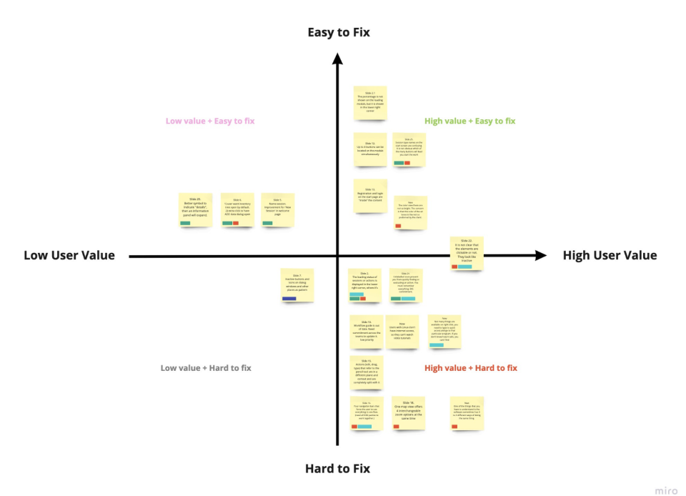
A recommendation is easy to nod at and ignore. So I handed the teams a ranked list of the findings that hurt users most, each traced back to the sessions it came from.
Together with the product owners we rewrote the backlog against that list — reordering, dropping what the evidence did not support, adding the repairs nobody had logged.
What changed
Seven teams, one shared picture
The result that mattered was organisational. Seven teams working to independent roadmaps came onto one goal, with evidence — not opinion — about where the product was failing people.
Being straight about the ending: the redesign moved into a next phase awaiting funding. I can show what the research changed in how teams prioritised, not a shipped learnability number.
- First structured user research in the product’s history
- Seven delivery teams aligned to a single goal
- Evidence-based prioritisation adopted by the product owners
- New-feature work paused in favour of repairing core workflows
- Four designers led through their first end-to-end research programme