The brief
Companies were quietly moving their corporate cards to other banks.
Raiffeisen Bank Aval sells corporate cards to businesses: one company account, cards issued to the staff who spend against it. Demand for the product had dropped and the bank did not know why.
They wanted the reason — and whether covering the unmet needs could become a market advantage rather than a patch. The working theory in the room, the client’s and initially ours, was that the end user was afraid to use the card: worried they would make a mistake and end up covering the loss from their own pocket.
The product
A company card, and the three people it touches
A corporate card is a bank card tied to a company’s account. Employees pay for business travel, fuel, supplier invoices and client dinners with it, so nobody has to spend their own money and chase it back.
It is a B2B product with a B2C surface: the bank sells it to a company, but three different people live with it daily — and a fourth, the bank’s own relationship manager, sits on the other side of every request they make.
The employee
Carries the card. Pays for things. Keeps receipts.
The accountant
Reconciles what was spent, prepares it for the tax authorities.
The manager
Opens and closes cards, and controls the limits on them.
The research
We drew the journey we expected, then went to check it
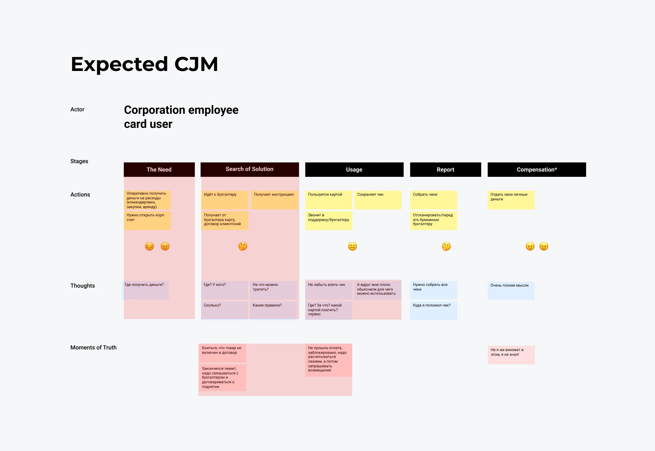
Design sprint, two UX designers. We started from the client’s own belief rather than pretending we had none. In a workshop with the bank we named the roles that touch the product — cardholder, accountant, corporate manager, bank manager — and mapped how the client thought each of their journeys went.
Writing the assumption down first is what made the difference. It gave us something falsifiable. When we then interviewed real users, the gaps were not vague disagreements: they were specific cells where the map and the world disagreed, and we marked every one of them in red.
Honest limits. This was qualitative work: interviews, journey mapping, competitor analysis and a usability test with a group of users. It can tell you what breaks and why it breaks. It cannot tell you how many customers it breaks for, and we never sized the problem financially.
1 · Stakeholder interviews
Capturing what the bank believed was happening, and why demand had fallen.
2 · The expected journey
A journey map per role, drawn in a workshop exactly as the client perceived it.
3 · Interviews with real users
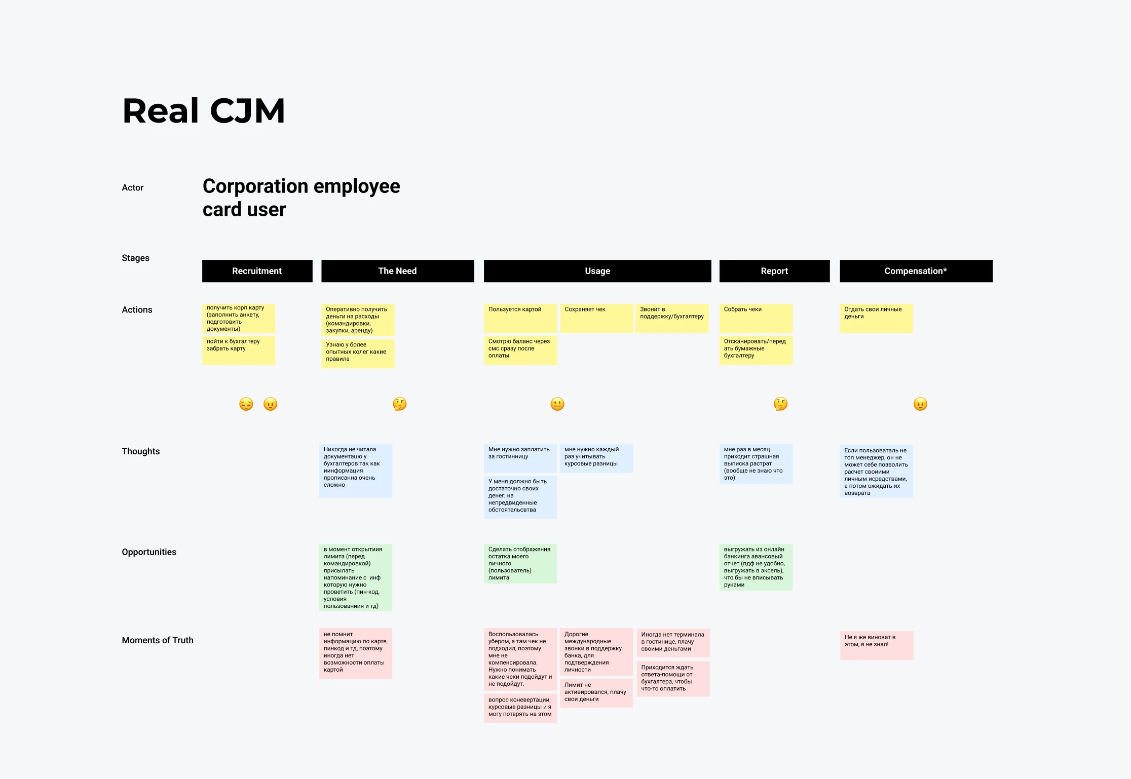
The discrepancies showed up immediately. Every point that did not match reality was marked.
4 · The real journey, rebuilt
Redrawn from what users actually described, with the opportunities each stage exposed.
5 · Analysis and competitor review
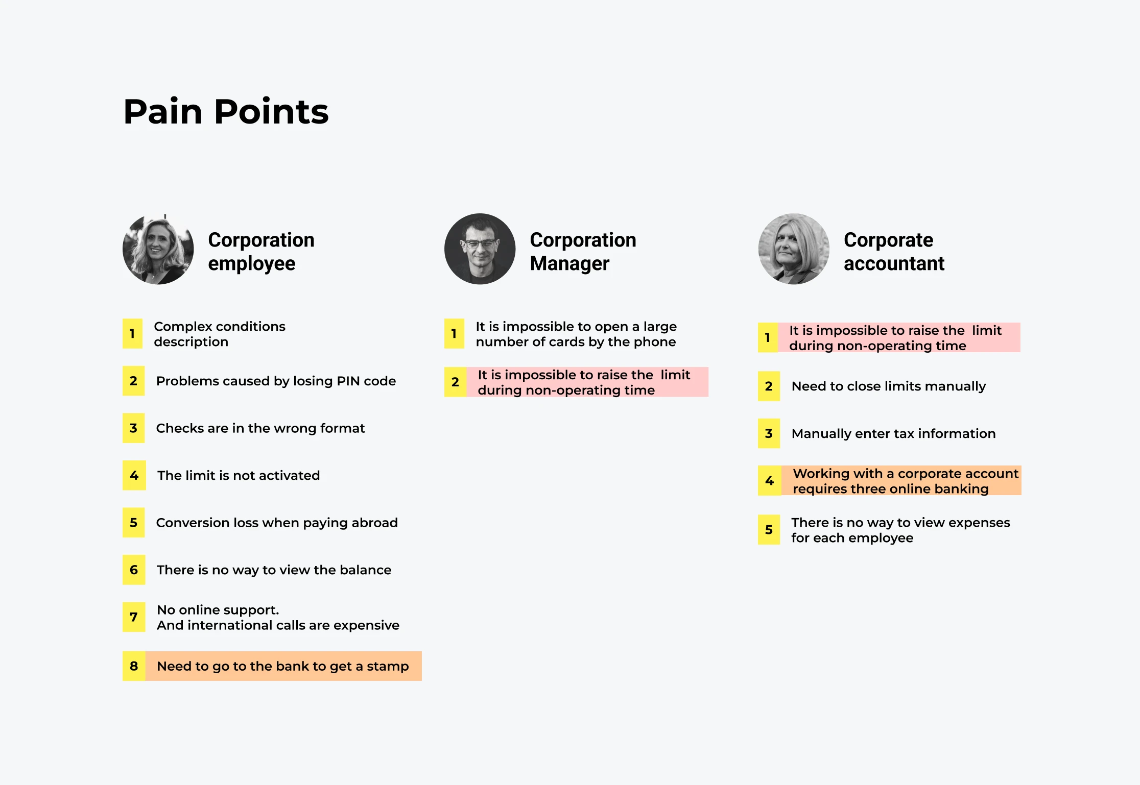
Pain points per role, colour-coded where they overlap, set against what other banks already offer.
6 · Prototype and usability test
Changes to the bank’s mobile app, tested with a user group and adjusted on the feedback.
“We have the money, but we cannot increase the limits. The situation remains unchanged, the management is frustrated, and the issue of switching to another bank has been raised.” Corporate manager, user interview
The turn
We had been looking at the wrong person
The cardholder was fine. Nothing in their experience explained why companies were leaving.
The pain sat with the corporate manager and the accountant. Opening cards meant a letter to the bank — by phone, a call-centre session runs fifteen minutes and the company has two hundred cards. Raising a limit meant another letter and a wait; out of hours, nobody answered at all. The accountant closed limits by hand, typed tax data manually, and needed three separate banking systems to do one job.
Neither of them ever touches the card. They are the ones who decide whether the company keeps it.
Their problems also overlapped — limits out of hours blocked both — so one fix could pay twice.
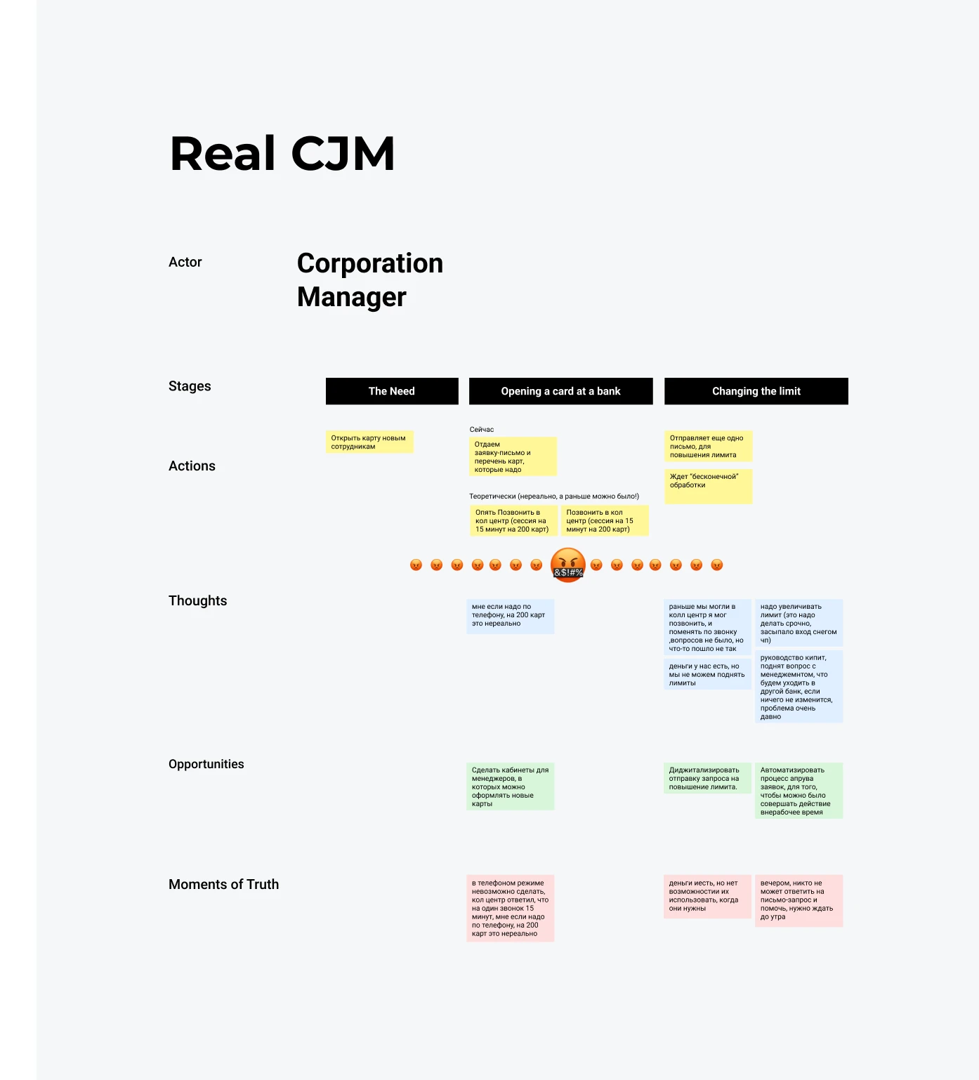
The corporate manager’s real journey. The row of faces under the middle stages is not decoration — it is where two hundred cards meet a fifteen-minute phone call.
The market
Two of the impossible things were already shipping elsewhere
Before proposing anything we ran a competitor analysis — walking through the client banking of the other banks these companies could move to, and what their corporate programmes give these same roles. Integration with the accounting systems Ukrainian bookkeepers actually use. A single operating window across branches and subsidiary companies. Limits the client sets themselves, without phoning anyone.
That reframed the recommendation. It was no longer a wish list of improvements — it was a baseline the product had to meet just to stay in the comparison, plus the things that could put it ahead.
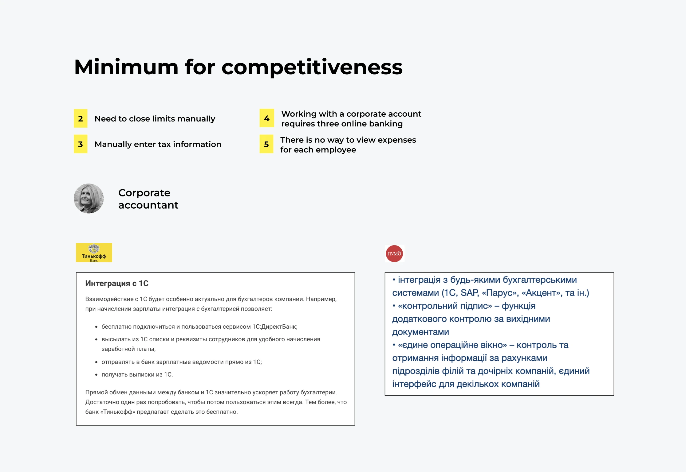
The competitive minimum, mapped against the accountant’s numbered pain points.
What we proposed
Changes aimed at the people who never touch the card
Not a redesign of the card experience — a set of changes to the work that surrounds it, ordered by how many roles each one relieved. The cardholder’s side went into a prototype and a usability test; the administrators’ side went to the client as the baseline they had to meet.
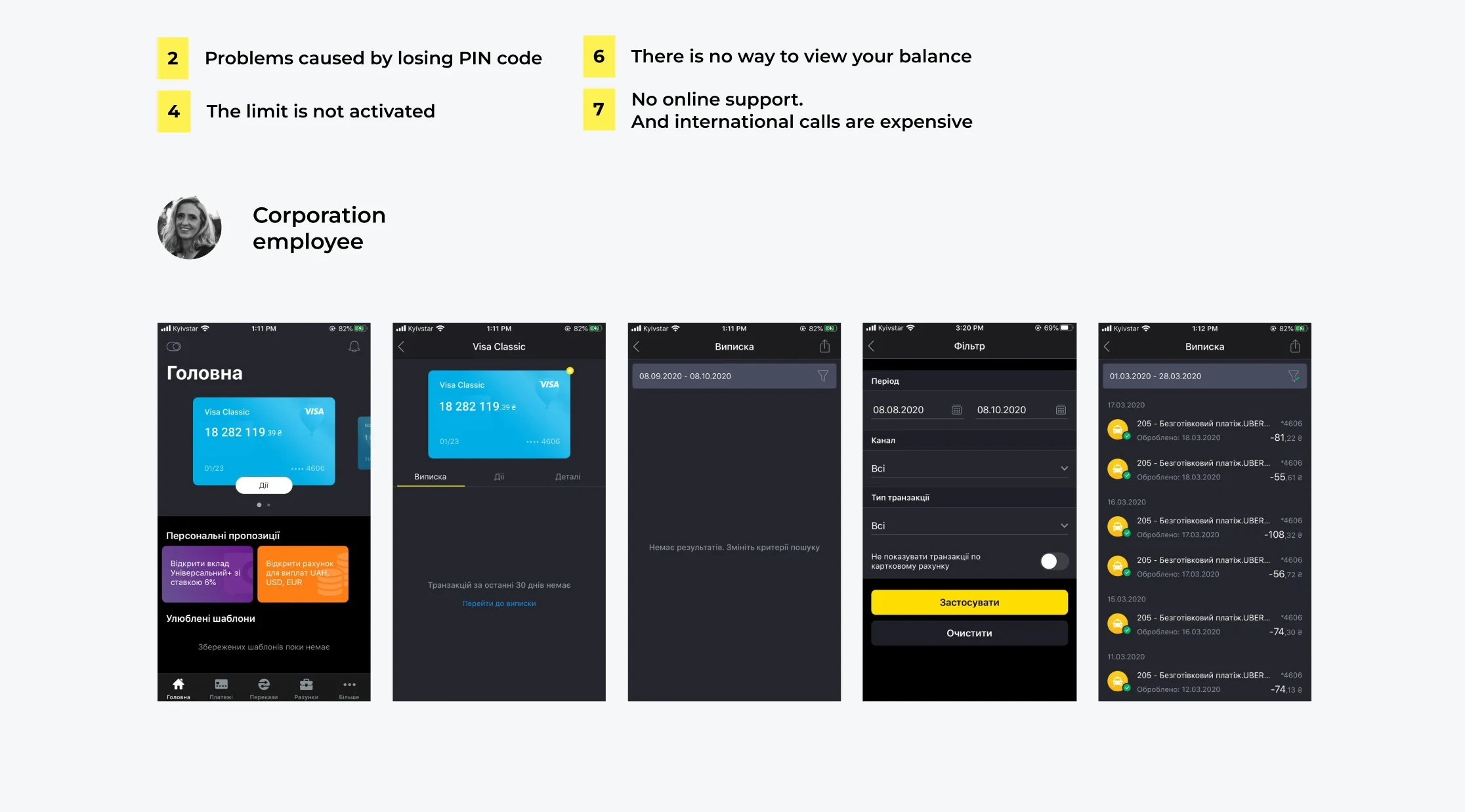
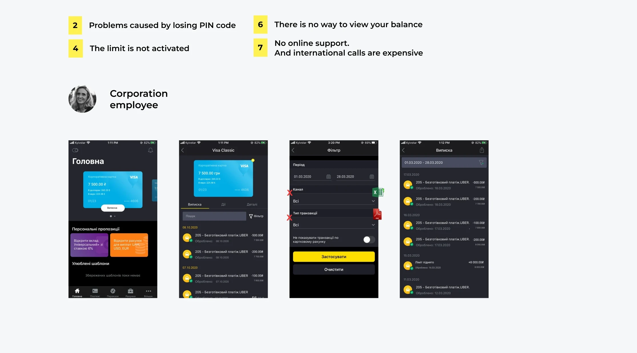
1Their own balance, not the company’s
The amount available on this card, in every currency they might have to pay in.
2An advance report they can export
Statements out of the app in the format the accountant needs, as Excel and PDF, instead of a trip to the branch for a stamp.
3A PIN they can change themselves
One of the most common reasons a card stopped being used at all.
4Statements per employee
So the accountant can see what one person spent without unpicking a merged feed.
5Self-service limits, with verification
The manager sets the limit and confirms their identity, rather than writing a letter and waiting.
6Automated approval out of hours
The request that used to sit until morning goes through when the trip is actually happening.
What changed
The value was not a redesign
It was stopping a bank from spending months improving the wrong experience for the wrong user. The reasons behind the low demand were identified, the problems compiled into a list ordered by how many roles each one blocked, and the recommendations handed over with the reasoning attached.
Being straight about the ending: my engagement finished at the recommendation stage. I can show that the problem was redefined and evidenced. I cannot show a retention number, because implementation and measurement sat with the bank after we handed over.